Design a Checkout page
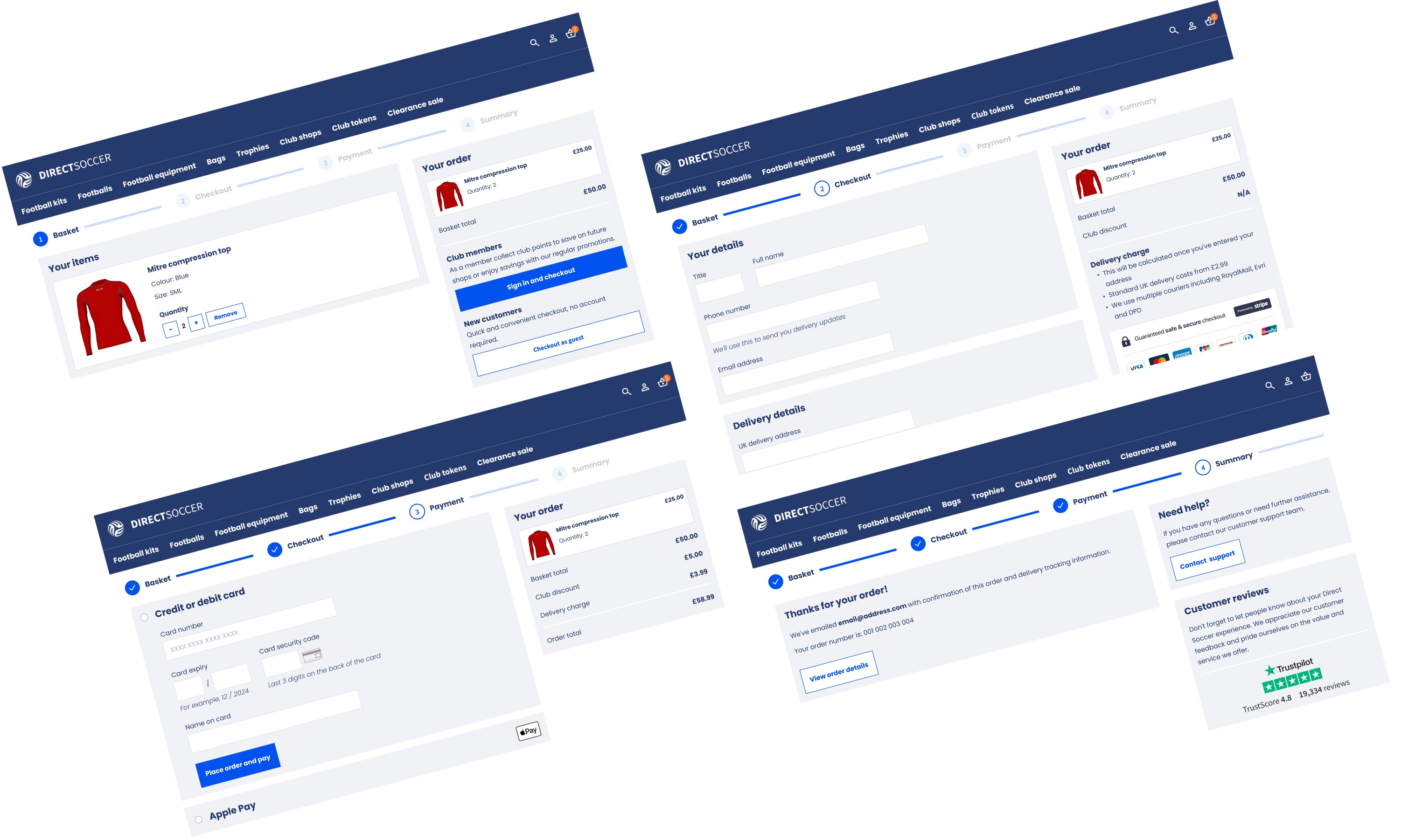
The challenge
DirectSoccer's checkout had long, scrolling pages that buried calls to action on laptop screens. Whitespace was used poorly. The forms used placeholder text that looked like entered values, and field widths that didn't match their inputs.
I needed to redesign the checkout to build trust and cut friction from the flow.
Process
I focused the redesign on building user confidence: trusted reviews, membership discounts, clear delivery costs, and visible secure payment. I cut the form down to fewer fields and added a stepped flow with visible progress. I researched patterns, including the UK Government's accessible payment forms, then wireframed and prototyped the flow in Miro and Figma, using real screenshots from the live site.
Gallery
Results
The final flow kept DirectSoccer's existing brand, but simplified the header and stripped back the form. It used customer reviews, a card-number mask, and recognised payment providers as visual cues for trust. A persistent order summary and an end-of-journey help button rounded out the experience.
Key learnings
Small trust signals — reviews, secure payment badges, clear delivery costs — did as much for user confidence as the layout and form changes themselves.
Role
Category
Uxcel